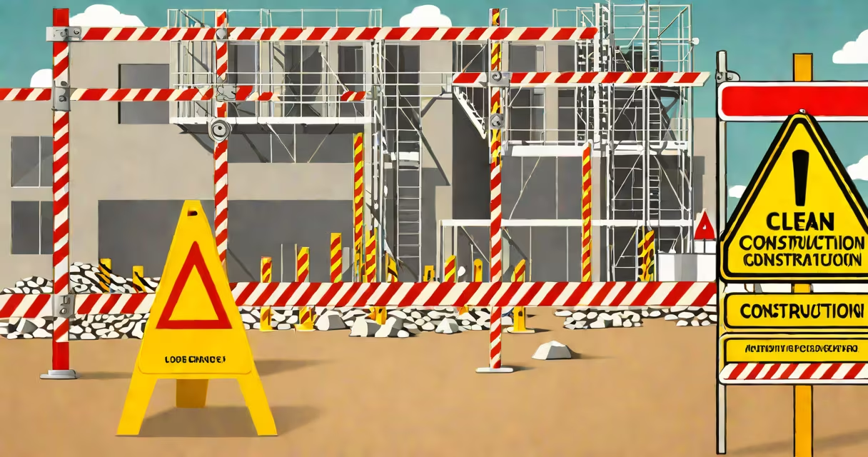
Construction site signage consists of standardized, visible signs used to communicate safety rules, identify hazards, direct traffic, and mark restricted zones on job sites. These signs comply with OSHA and ANSI standards and are placed at entry points, high-risk areas, and near equipment.
Signs serve immediate, actionable roles. A "Hard Hat Required" sign at the entrance tells everyone entering they must wear protective headgear. A "Do Not Enter - High Voltage" sign near electrical panels prevents accidental contact. These are not decorative-they're legally mandated tools to reduce injury and prevent accidents.
Each sign uses color, symbols, and text to convey urgency and meaning quickly. Red means danger or prohibition. Yellow indicates caution. Green shows safe conditions. Blue signals mandatory actions. This system is consistent across U.S. construction sites and follows guidelines set by the American National Standards Institute (ANSI) and enforced by OSHA.
Signs function through visual recognition under time pressure. Workers often have seconds to react to risks. A clear, standardized sign reduces cognitive load and ensures instant understanding-even if someone doesn't speak English.
For example, a "Falling Objects" sign with a pictogram of a falling tool above a worker's head appears near scaffolding. The symbol is universally recognized. Even if the word "falling" is misread due to poor lighting, the image still communicates risk. This design principle is called "universal design" and is required for safety signs under ANSI Z535 standards.
Signs are also timed. A "Work in Progress" sign may stay up for weeks. A "Trench Collapse Risk" sign remains until shoring is installed. Signs are removed only when the hazard no longer exists. Leaving outdated signs up creates confusion and undermines credibility.
Signs fall into four functional categories: warning, mandatory, informational, and emergency. Each uses specific colors, shapes, and symbols.
| Type | Color | Shape | Common Symbols | Examples |
|---|---|---|---|---|
| Warning | Yellow with black border | Triangular | Exclamation mark, hazard icon | "Slippery When Wet," "High Voltage" |
| Mandatory | Blue with white symbol | Circular | Person with hard hat, safety goggles | "Hard Hat Required," "Safety Glasses Mandatory" |
| Informational | Green with white text | Rectangular | Exit arrow, first aid cross | "Emergency Exit," "First Aid Station" |
| Emergency | Red with white symbol | Rectangular or circular | Flame, person running | "Fire Extinguisher," "Evacuation Route" |
Materials vary based on environment. Plastic signs resist weather and impact. Aluminum signs last longer in high-wind areas. Temporary vinyl signs are used for short-term projects. All must withstand UV exposure, rain, and physical contact.
A non-obvious rule: signs must be visible from 10 feet away. OSHA requires that warning signs be readable at a distance of at least 10 feet. A sign posted too far back fails its purpose. One site I inspected had a "No Entry - Excavation Zone" sign mounted 20 feet from the trench edge. It was invisible to workers approaching from the side. The contractor was cited for non-compliance.
Signs are placed at entry points, around machinery, near trenches, and at intersections. They reduce risk by creating clear boundaries between safe and dangerous zones.
For example, a "Trench Collapse Hazard" sign must be within 10 feet of the excavation edge. It's not optional. OSHA regulation 29 CFR 1926.651(g)(1) mandates this placement. Failure to follow it results in fines up to $14,500 per violation.
Signs also support legal accountability. If a visitor enters a zone marked "Authorized Personnel Only" and gets hurt, the employer can show evidence that the hazard was communicated. This defense is critical in injury lawsuits.
On large urban sites, signs are part of a larger system. A construction site near downtown Chicago used digital signage to display real-time updates: "Crane Operation in Progress - Stay 50 Feet Back." This changing approach reduced near-misses by 40% compared to static signs alone.
Many assume that any sign with "danger" written on it counts. That's false. The sign must meet ANSI Z535 standards for font size, contrast, and symbol clarity. A hand-painted "Caution: Falling Debris" sign with small letters and low contrast fails inspection.
Another error: using generic signs for site-specific risks. A "Chemical Spill" sign is standard, but if the site handles flammable solvents, the sign must specify "Flammable Liquid - No Open Flames." Generic signs lack precision and reduce effectiveness.
Some contractors reuse signs from past jobs. A "Demolition Zone" sign from a 2019 project was reused on a 2023 site. It lacked updated hazard details and was missing the current project ID. OSHA inspectors flagged it during a routine check. The site had to replace all outdated signs.
One key correction: signage is not a substitute for training. A "Ladder Safety" sign won't stop someone from standing on the top rung. But combined with a safety briefing, it reinforces behavior. Signs work best as part of a layered safety program.
A bridge repair project in Seattle used a structured signage plan. Entry gates displayed "Hard Hat Required" and "No Unauthorized Access." Near the crane zone, yellow triangular signs read "Overhead Crane - Keep Clear." A blue circle sign showed a worker with goggles and said "Eye Protection Mandatory."
At the work platform edge, a green rectangular sign said "Emergency Exit - 150 ft." A red sign with a flame symbol pointed to fire extinguishers. All signs were mounted at eye level, with reflective backing for night visibility.
After six months, the site reported zero incidents related to signage failure. Inspectors praised the consistency and placement. The project manager noted that signs reduced verbal reminders by 60%. Workers knew the rules without being told.
OSHA sets federal rules for construction site signage. The agency requires that signs be durable, legible, and placed where they can be seen. OSHA's 29 CFR 1926.200 outlines minimum requirements for warning signs.
ANSI Z535.4-2011 provides detailed guidance on sign design, including font height, contrast ratios, and symbol usage. For example, the minimum letter height for warning signs is 1/8 inch per 10 feet of viewing distance. A sign meant to be seen from 30 feet must have letters at least 3/8 inch tall.
Every construction site must use correct signage. It's not optional. It's not a formality. It's a legal requirement and a life-saving tool. When done right, construction site signage keeps people safe, avoids fines, and supports efficient operations.