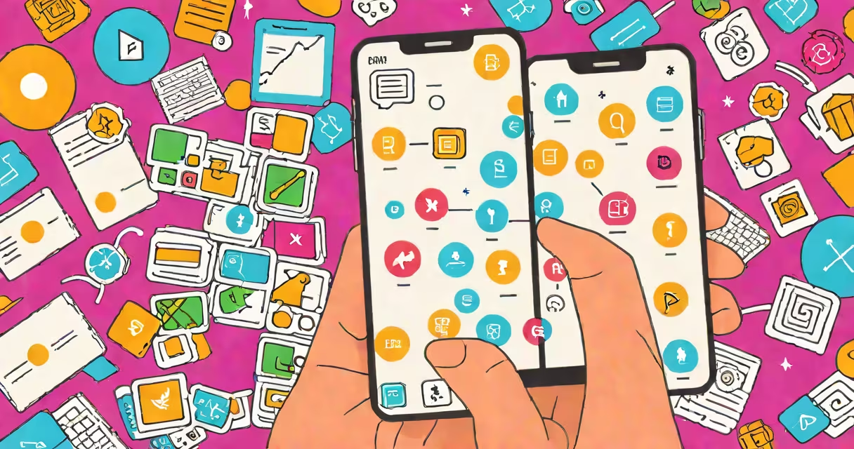
User interface (UI) and user experience (UX) in software refer to the visual design and interaction flow that users encounter when using a digital product. UI focuses on how the product looks and feels, while UX centers on how well it functions and meets user goals. Together, they determine whether software is easy to learn, efficient to use, and satisfying to interact with.
UI is the set of screens, buttons, icons, typography, and color schemes users see and touch. It's the visual layer of a software application. UX is the process of designing the entire process a user takes-from first launch to completing a task. It includes research, wireframing, prototyping, testing, and iteration based on real user behavior.
For example, a banking app's UI shows the layout of account balances, transaction history, and the "Transfer Money" button. The UX helps transferring funds takes no more than three taps, confirms actions, and prevents errors-like sending money to the wrong person-through thoughtful design choices.
UI and UX are distinct but interdependent. A beautiful interface with poor UX fails users. A functional app with confusing visuals frustrates them. The most successful software blends both elements smoothly.
Consider the Spotify app. Its UI uses bold colors, large album art, and consistent iconography. But the UX helps searching for a song, creating playlists, and adjusting playback volume happens quickly and predictably. Users don't have to think-actions feel natural.
Designers start with UX: they map out user flows, conduct interviews, and test assumptions. Once the structure is solid, UI designers apply visual language-fonts, spacing, animations-to make the product engaging and brand-aligned. This sequence prevents wasted effort on features no one wants.
UI and UX aren't monolithic-they consist of specific disciplines, each with measurable outcomes.
| Type | Focus Area | Key Output | Example |
|---|---|---|---|
| Visual Design | Color, typography, layout, imagery | Consistent, aesthetically pleasing interface | Netflix's dark theme and card-based layout |
| Interaction Design | Button feedback, transitions, micro-interactions | Responsive, intuitive motion cues | Instagram's heart animation when liking a post |
| Information Architecture | Content organization, navigation structure | Clear paths to tasks | Amazon's category tree and search filters |
| Usability Testing | Real user behavior observation | Data-driven improvements | Testing a checkout flow with 10 participants to reduce drop-off |
Many teams use tools like Figma for UI mockups and Maze for remote usability testing. These tools allow designers to simulate real interactions and gather quantitative metrics-such as task success rate and time-on-task-before development begins.
People often confuse UI with UX. A common mistake is thinking that a sleek design equates to good user experience. But aesthetics alone don't improve functionality.
For example, a travel booking site with high-resolution images and animated transitions may look impressive-but if users can't find flight options under $300, the UX fails. Conversely, a minimalist interface with small text and unclear labels can frustrate users even if it's visually clean.
A key distinction: UI is about appearance; UX is about outcome. A UI designer chooses fonts and buttons. A UX designer asks: "Does this button help users complete their goal?"
One non-obvious fact: UX isn't just about making things easier-it's about reducing cognitive load. Research from Nielsen Norman Group shows that users abandon sites after 15 seconds if they don't understand how to proceed. A well-designed UX anticipates confusion and guides users silently.
Software with strong UI and UX drives engagement, reduces support costs, and increases conversion rates. According to a 2023 report by Forrester Research, companies that invest in UX see a 200% return on investment through higher customer retention and reduced error rates.
I once worked on a healthcare portal redesign. Initial versions had complex forms and dense text. After conducting usability tests, we simplified the layout, added progress indicators, and replaced jargon with plain language. Task completion rates rose from 58% to 89% within two weeks of launch.
Another example: Apple's iOS design system enforces consistency across apps. Buttons behave the same way everywhere. This reduces learning time and builds trust. When users know what to expect, they act faster and with fewer mistakes.
Even small changes matter. A study published in the Journal of Usability Studies found that changing a form's submit button from "Next" to "Continue" increased completion rates by 12%. The wording influenced perceived progress and reduced hesitation.
Beginners should start with low-fidelity prototypes-paper sketches or basic digital wireframes-before diving into polished UI. This practice helps function precedes form.
What is ui ux in software? It's the invisible architecture behind every smooth interaction. It's not just about looking good-it's about working well for real people in real situations.